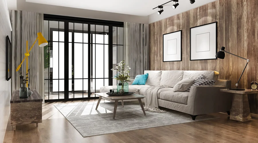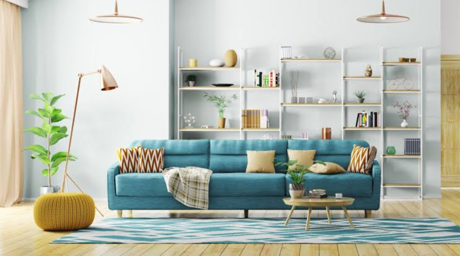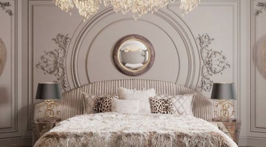
Our design team tested over 40 paint swatches across 15 real living room renovations this year, evaluating each shade under direct tropical daylight, 3000K warm LED lighting, and high-humidity indoor conditions.
Your living room is where your family spends time together, and where guests get their first impression of your home. In 2026, homeowners are moving away from cold, stark whites and bright synthetic shades toward warmth, nature and timeless comfort. Here's our handpicked list.

1. Warm Beige — the new neutral standard
Cool white walls are fading out. Warm beige adds instant cosy comfort without feeling plain or dated — modern warm beige uses soft grey undertones to stay fresh rather than yellow-heavy like older creams.
- Exact shade match: Asian Paints Warm Oat (0312) / Dulux Heritage Cream
- Recommended finish: Velvet or Eggshell
- Designer tip: In our client projects this year, warm beige performed best in living rooms with natural wooden flooring — it softens harsh afternoon glare while keeping the room airy.
Best paired with: Teakwood coffee tables, off-white linen curtains, indoor money plants.

2. Sage Green — nature comes indoors
One of our most requested paint colours in 2026. It bridges the outdoor garden and indoor living space, creating a calm, peaceful atmosphere.
- Exact shade match: Asian Paints Soft Sage (7842) / Berger Earthy Green (4101)
- Recommended finish: Matte
- Designer tip: On west-facing walls in tropical climates, sage green's cool undertones noticeably reduced visual heat during bright afternoons.
Best paired with: Light oak furniture, cream sofas, warm brass wall sconces.

3. Soft Terracotta — earthy warmth
Inspired by natural clay pottery, terracotta brings personality and a rich, cosy backdrop that makes seating areas feel intimate.
- Exact shade match: Dulux Earthen Clay (42YY 35/381) / Asian Paints Rustic Terracotta (0521)
- Recommended finish: Silk or Low-Sheen Satin
- Designer tip: Terracotta can feel heavy on all four walls — we recommend using it on a single focal wall behind the main sofa.
Best paired with: Beige fabric couches, woven jute rugs, warm 3000K LED lighting.

4. Warm White — bright, clean and soft
If you prefer white walls, skip stark pure white — it reflects too much light and can feel cold. Warm white carries subtle yellow and brown undertones that catch sunlight gently.
- Exact shade match: Berger Silk White (1002) / Dulux Warm Ivory
- Recommended finish: Eggshell
- Designer tip: Our go-to for compact living spaces under 150 sq. ft. — it opens the room up without losing warmth.
Best paired with: Dark wooden accents, colourful artwork, sheer white drapes.

5. Dusty Blue — calm elegance
A soft slate grey blended with muted sky blue. It introduces gentle colour while keeping a sophisticated, calm feel.
- Exact shade match: Asian Paints Pacific Breeze (7312) / Dulux Quiet Blue
- Recommended finish: Matte
- Designer tip: Works exceptionally well with black metal window frames or dark furniture accents in modern apartments.
Best paired with: Light grey sectional sofas, silver lighting fixtures, ash-wood furniture.

6. Olive Green — deep, luxurious comfort
A darker green with warm yellow undertones — cosy and grounded rather than cold.
- Exact shade match: Asian Paints Deep Olive (7721) / Berger Forest Shadow
- Recommended finish: Matte
- Designer tip: Best kept for high-ceiling rooms or a dedicated TV feature wall — under evening warm light it creates an upscale, cinema-like feel.
Best paired with: Walnut furniture, caramel leather armchairs, warm gold floor lamps.

7. Greige — the flexible blend
The perfect mix of grey and beige — modern, but still warm, and one of the easiest colours to style around.
- Exact shade match: Dulux Urban Stone (30YY) / Asian Paints Modern Greige (8104)
- Recommended finish: Eggshell
- Designer tip: If you change cushions, curtains or rugs often, greige is the safest base — it matches almost any accent palette.
Best paired with: Black metal accents, marble tabletops, textured wool rugs.

8. Earthy Brown — rich, grounded comfort
Lighter earthy browns are replacing outdated dark chocolate shades, bringing warmth and stability to family rooms.
- Exact shade match: Berger Warm Walnut (0411) / Asian Paints Earthy Tan
- Recommended finish: Matte
- Designer tip: Hides daily scuffs and dust better than light walls — a practical choice for homes with young children or pets.
Best paired with: Cream upholstery, rattan decor, large indoor leaf plants.

9. Muted Peach — cheerful and soft
A gentle blend of soft pink, orange and cream that creates a friendly, upbeat mood while staying subtle enough for main living areas.
- Exact shade match: Asian Paints Peachy Glow (0214) / Dulux Soft Coral
- Recommended finish: Satin
- Designer tip: Bounces natural sunlight beautifully in rooms without large exterior windows.
Best paired with: Light wood flooring, soft grey throw pillows, minimalist white furniture.

10. Charcoal Grey accent wall — modern contrast
Instead of painting an entire room dark, a single charcoal wall behind the TV or sofa creates strong visual interest without shrinking the room.
- Exact shade match: Asian Paints Charcoal Shadow (8291) / Berger Dark Slate
- Recommended finish: Super Matte
- Designer tip: Always use super-matte behind a television to prevent glare from ceiling lights.
Best paired with: Off-white side walls, warm LED backlight strips, natural wood units.
How to choose the right colour
Before buying paint, run through this simple 4-step checklist:
- Check room direction & daylight. North/east walls get cooler, softer light — use warmer tones like Warm Beige or Muted Peach. South/west walls get intense afternoon sun — balance with cool tones like Sage Green or Dusty Blue.
- Match paint with ceiling height. Under 9 feet, paint the ceiling pure white and keep walls light to create height.
- Test sample patches. Paint a 2×2 ft patch and check it at 8am daylight, 2pm direct sun, and 8pm under room lights.
- Choose the right sheen. Matte hides bumpy walls and suits accent walls; eggshell/velvet balances shine and cleanability for high-traffic rooms; satin/silk reflects light well in smaller or darker spaces.
Colour trends for Indian homes & warm climates
Indian living rooms often deal with high sunlight, warm weather and dust. Here's how to adapt these trends for durability and comfort in cities like Coimbatore, Chennai or Bangalore:
- Use Sage Green & Greige to reduce glare
- Balance strong sun with muted undertones
- Choose washable Velvet/Silk finishes
- Lean on earthy tones — they hide scuffs effectively
Vastu & lighting balance: soft earth tones (beige, warm white) in the north-east help reflect bright sunlight gently. Managing glare: Sage Green and Greige absorb harsh sunlight on west-facing balconies. Dust resistance: washable velvet-matte finishes clean easily with a microfiber cloth, unlike glossy finishes that highlight fine dust.
Final thoughts
The top living room colour trends for 2026 focus on warmth, comfort and natural beauty — soft neutrals, earthy greens, warm whites and rich accents that feel peaceful rather than stark. Pair a trending shade with quality furniture, proper lighting and thoughtful decor, and it holds up for years, not just a season.
If you're looking for professional interior designers in Coimbatore, expert guidance can help you pick a palette that matches your home's light, style and everyday needs.
Not sure which shade fits your room?
Share a photo of your living room with an owner — we'll recommend the shade and finish that actually suits your light and layout.